

A kitchen HMI near the fridge for meals and expiring food
Notes for a small LCD/TFT HMI mounted near the fridge, using Home Assistant to show meal plans, expiring food, and quick shopping-list actions.
Share
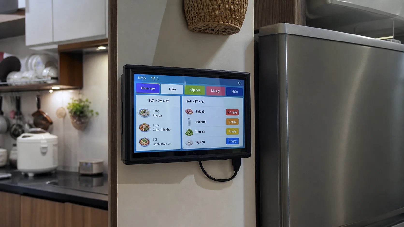
If you build a similar panel, I recommend starting with very few interactions and adding features only after it feels useful in the kitchen.
There is a very normal kitchen problem: I open the fridge, see yesterday's leftovers, a bag of vegetables from the weekend, a few eggs, and still need a moment to decide what should be cooked first.
I want a small HMI near the fridge for that exact moment. Not a pretty tablet dashboard, but a color touchscreen with a few clear buttons: see today's meals, check what is expiring, tap "used" when something leaves the fridge, or add an item back to the shopping list.
If it is mounted in the right place, it feels less like another app and more like a small control panel for the kitchen.
What should the first version do?
The first version only needs four tabs:
- Today: breakfast, lunch, dinner.
- Week: the next few meals.
- Expiring: food that should be used first.
- Buy: a short shopping list.
I would not turn it into a full Home Assistant tablet dashboard. A kitchen screen should be more direct: large text, clear colors, few menu layers, and usable while cooking.
Hardware proposal
There are two reasonable paths:
| Path | Best for |
|---|---|
| ESP32-S3 + 4.3/5 inch TFT + LVGL | Embedded feel, fast boot, lower power, focused UI |
| Raspberry Pi Zero 2 W / Pi 4 + 5/7 inch HDMI screen | Web app UI, richer rendering, easier API work |
For a compact embedded feel, I would start with ESP32-S3 + LVGL. If I want to build a web UI quickly and call more complex APIs, a Pi kiosk will be easier.
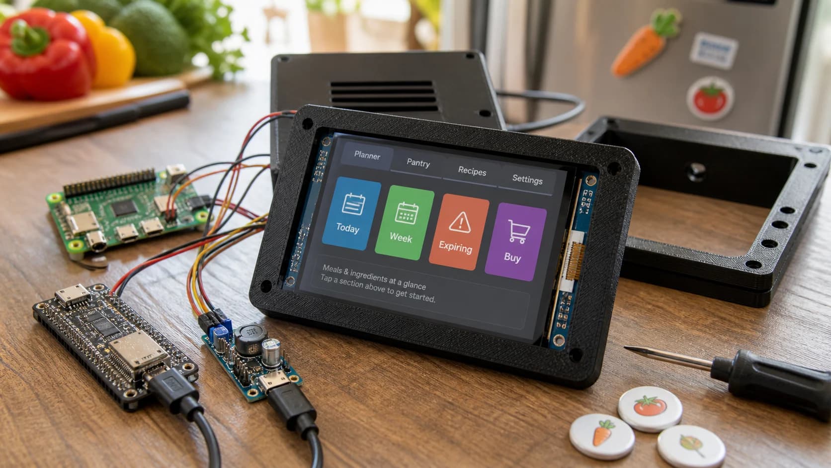
The supporting image shows the hardware prototype, separate from the installed kitchen cover scene.
How it works
The useful part is that this screen is not only for looking. It should let me update the data while I am still standing in the kitchen.
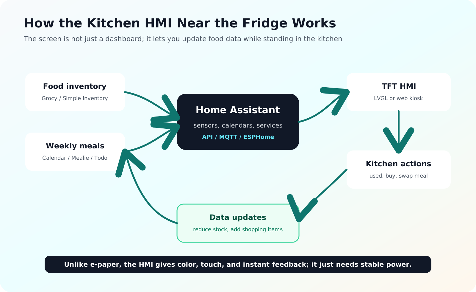
The HMI is different from a passive display because it lets you update food data while standing in the kitchen.
The simple flow:
Simple Inventory / Grocy / Home Assistant
  -> provides meals, stock, and expiring items
  -> HMI displays them with LVGL or a web kiosk
  -> user taps "used", "buy", or "swap meal"
  -> Home Assistant calls services/APIs to update the data
The action has to happen in the kitchen. If I finish a yogurt and need to open a phone app to update stock, I will forget. A large button next to the fridge has a much better chance of becoming a habit.
Make It A Kitchen Panel
The screen should have:
- Large touch targets.
- Clear colors: red for expired, yellow for use soon, green for normal.
- Short lists, no deep scrolling.
- A default "Today" screen.
- "Used" and "Add to buy list" actions next to each item.
I would avoid heavy animation, fancy gradients, and tiny cards. In the kitchen, people glance for a few seconds. The UI should not ask for much thinking.
Data entry without giving up
The biggest risk is the input habit. A home kitchen is not a warehouse, so too many fields will kill the idea quickly.
The first version should keep entry fast:
- Packaged items: scan barcodes when convenient.
- Fresh-market food: type "spinach, 1 bunch, 3 days".
- Opened items: tap "opened" to shorten expected life.
- Leftovers: quick-add "fish soup, 1 box, 2 days".
- Finished food: tap "used", then decide whether to add it to the shopping list.
For many homes, fresh food and leftovers matter more than barcodes. Quick manual entry is more important than a perfect inventory system.
Where Should It Mount?
I would not mount a powered screen directly on the fridge door. A wall, side cabinet, or panel next to the fridge is better:
- less vibration when the fridge door closes,
- easier USB-C cable routing,
- easier to see while cooking,
- no problems with curved metal doors or magnets.
The enclosure should be a little chunky, with ventilation, bottom cable routing, and a slight viewing angle. Looking like a real kitchen HMI is a good thing here.
Easy mistakes
Do not use a screen that is too small. A 2.8-inch display is cheap, but meal plans and food lists get cramped quickly. I would treat 4.3 inches as the comfortable minimum, with 5 or 7 inches feeling better.
Do not make the UI too mobile-app-like. HMI screens need fewer views and clearer buttons.
Do not depend entirely on barcodes. A lot of fresh food has none.
Do not require too much detail. Item name, quantity, and use-by hint are enough for a first version.
My first version
I would start with:
- 5-inch or 7-inch TFT touchscreen.
- ESP32-S3 if LVGL is enough; Raspberry Pi if a web app is faster.
- Wall or side-fridge mounting, USB-C power.
- Home Assistant + Simple Inventory or Grocy.
- Four tabs: Today, Week, Expiring, Buy.
- Buttons for "used" and "add to shopping list".
If it reduces the number of "when did we buy this?" and "what are we eating tonight?" moments after a week, the direction is right. This is not a decorative kitchen dashboard. It is a small HMI for making food decisions while standing at the fridge.
References
Share
Keep exploring
Read next
Related articles
A fridge and freezer temperature alert device for power outages
Notes for a small ESP32 box with two DS18B20 probes and Home Assistant alerts, meant to catch a warming fridge or freezer after a power outage.
A Vietnamese voice remote for local Home Assistant control
Notes for building an ESP32-S3 voice remote with ESPHome and a local Home Assistant Assist pipeline so Vietnamese voice commands can stay inside the home network.
A small IoT reminder to open the window when a room gets stuffy
Notes for a small ESP32 CO2 monitor on a desk, using SCD40/SCD41 to suggest opening the window when a room has stayed stuffy for too long.